Playbooks
Brand Guide
Logo
The EVEN logo is more than a mark, it signals artist ownership.
It represents balance, transparency, and a creator-first ecosystem.
Wherever it appears, the logo should feel strong, confident, and unmistakably EVEN.
How to Use Logo
Give the logo room to breathe and avoid stretching, distorting, or altering it in any way. No text, icons, or other design elements should enter this space.


Logo Safe Area
Maintain a clear space around it equal to the width of the letter “E” in EVEN. No text, icons, or other design elements should enter this space.
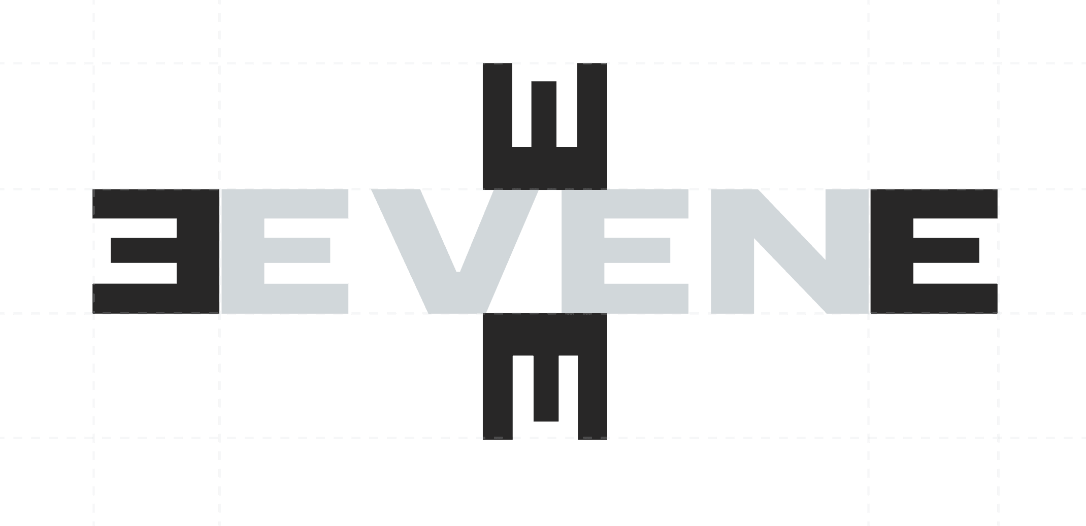
“E” Correct Use
The EVEN “E” can be used when space is limited or the full logo isn’t clearly visible, such as on small icons, merchandise, or social media profiles.
Use it thoughtfully and only when the full logo can’t fit as it should feel like part of the full identity, not a replacement.


Do's And Don'ts
Do's
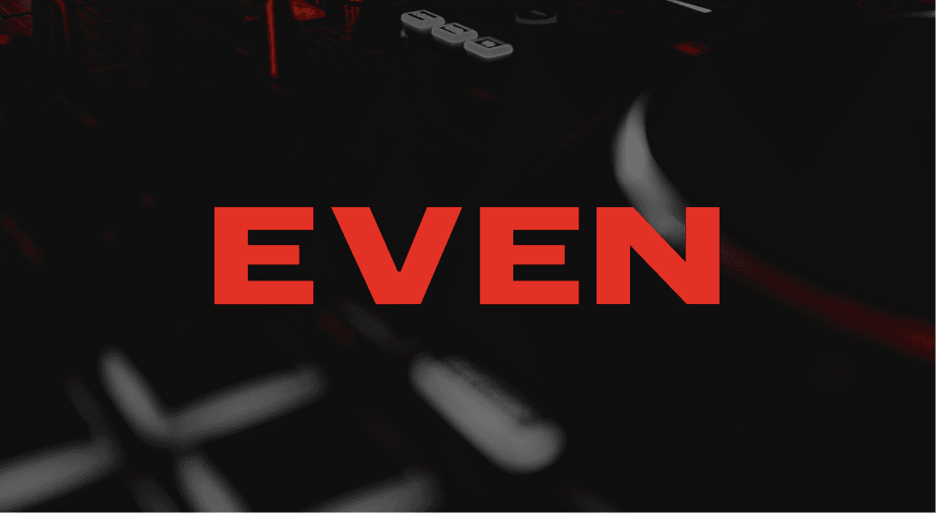
Use approved brand colors and maintain clear contrast.
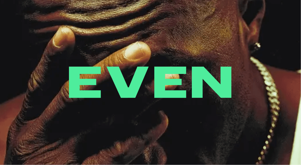
Pair the logo with imagery or tones that reflect the artist’s world.
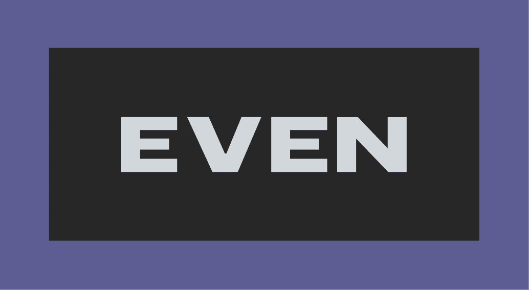
Keep enough spacing around the logo so it always stands out.
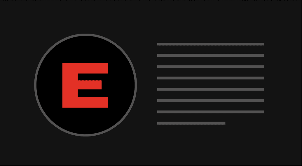
Use the “E” mark only when the full logo isn’t practical.
Dont's
Stretch, distort, or crop the logo.
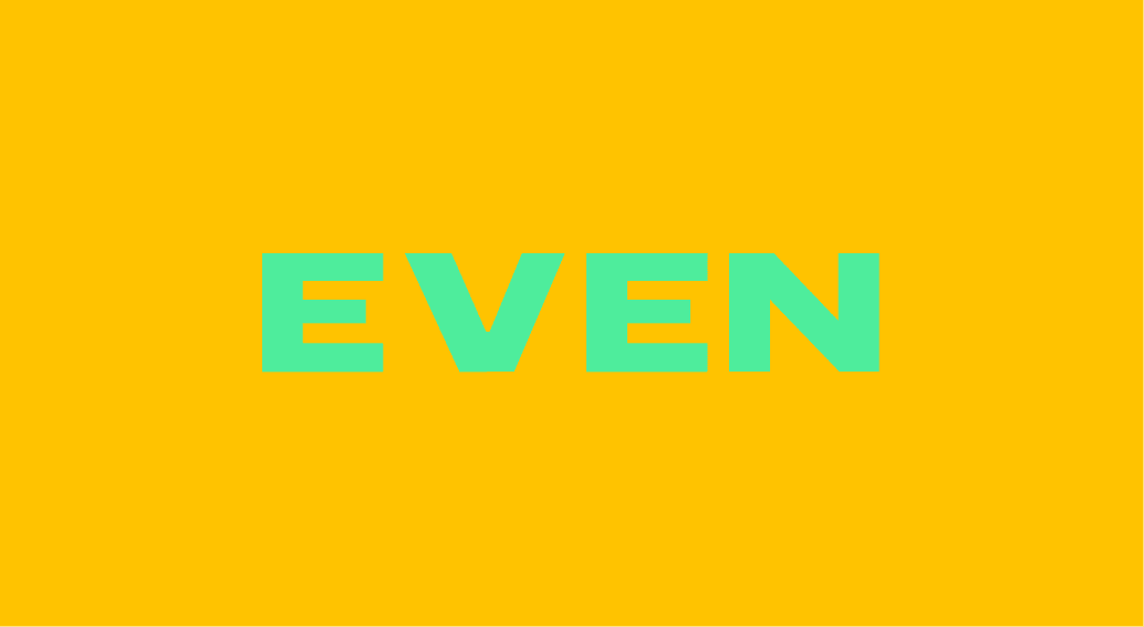
Change the colors outside of the official palette.
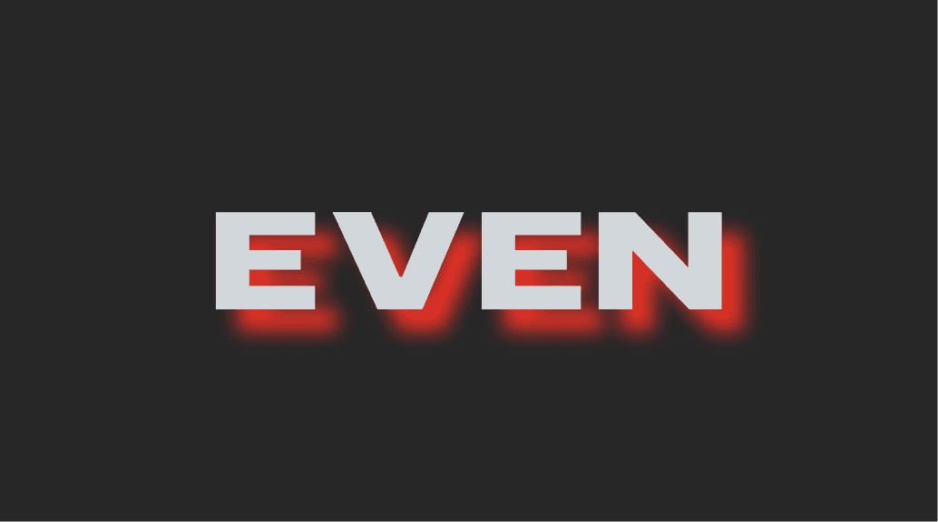
Add outlines, shadows, gradients, or filters.
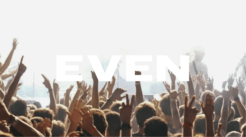
Place the logo over images or backgrounds that make it hard to read.


